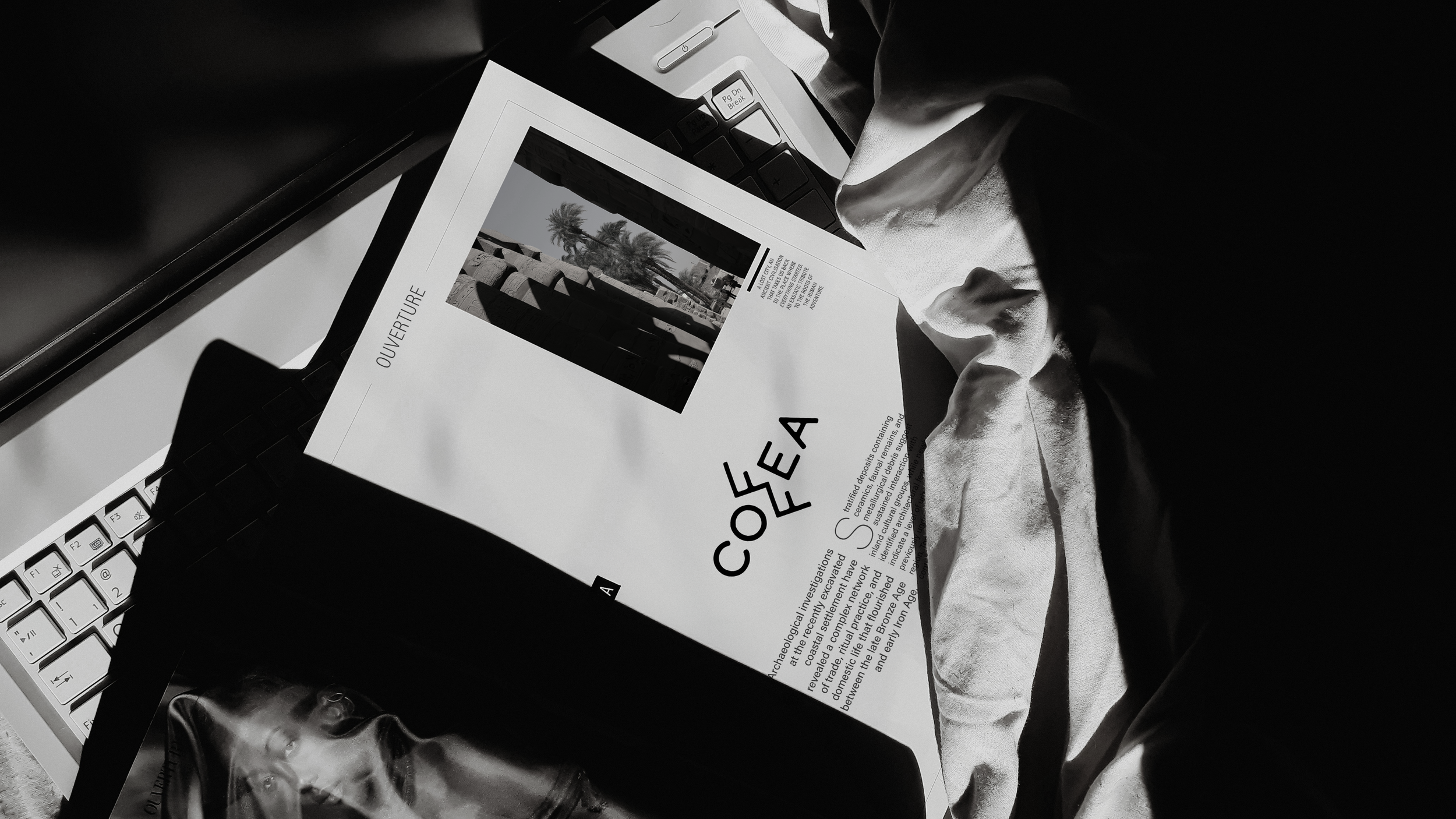
COFFEA
CLIENT: European Association of Archaeologists
YEAR: 2025
ROLE: Logo Design
SKILLS: Pencil & acrylic sketch, Digital Photography, iPad Procreate sketch, Photoshop sketch with HUION pen display, Adobe Illustrator, Adobe After Effects
STORY
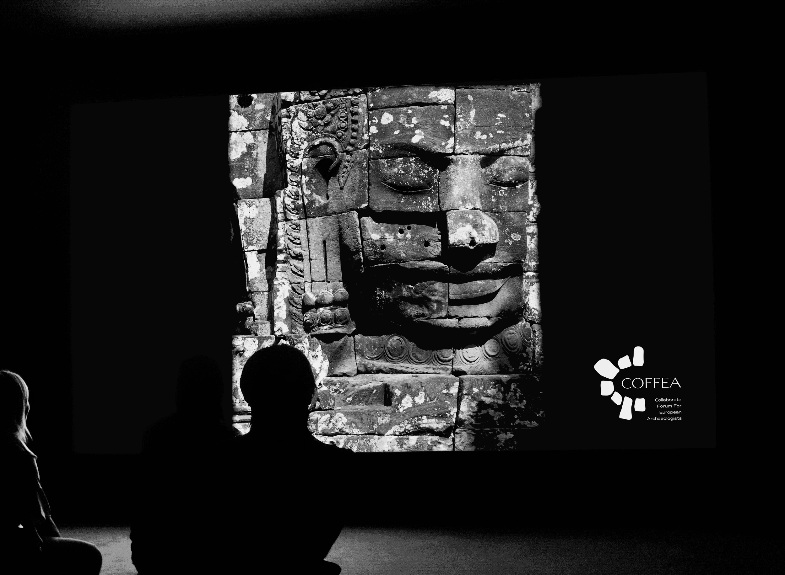
The European Association of Archaeologists, EAA, needed a new logo for the Collaborate Forum For European Archaeologists, COFFEA.
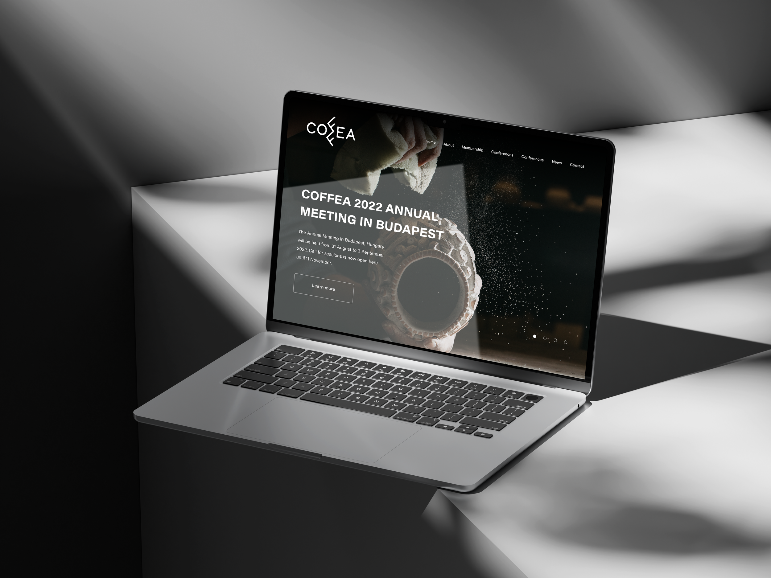
The Forum incorporates a social platform where people can get informed about the latest exciting news of Archaeology.
The logo should convey the appropriate messages to the viewer, where a prestigious association such EAA, organises an informative forum in a friendly social environment.
Mood: Adventurous, Smart, Ecstatic
Key words: Archaeology, Coffee/a, Forum
STRATEGY
For this project, three completely unique proposals were prepared.
Since the Forum was recently introduced to its audience, the main objective was to promote and establish its name through the logo — making it memorable, distinctive, and aligned with the organization’s goals.
PROPOSAL 1
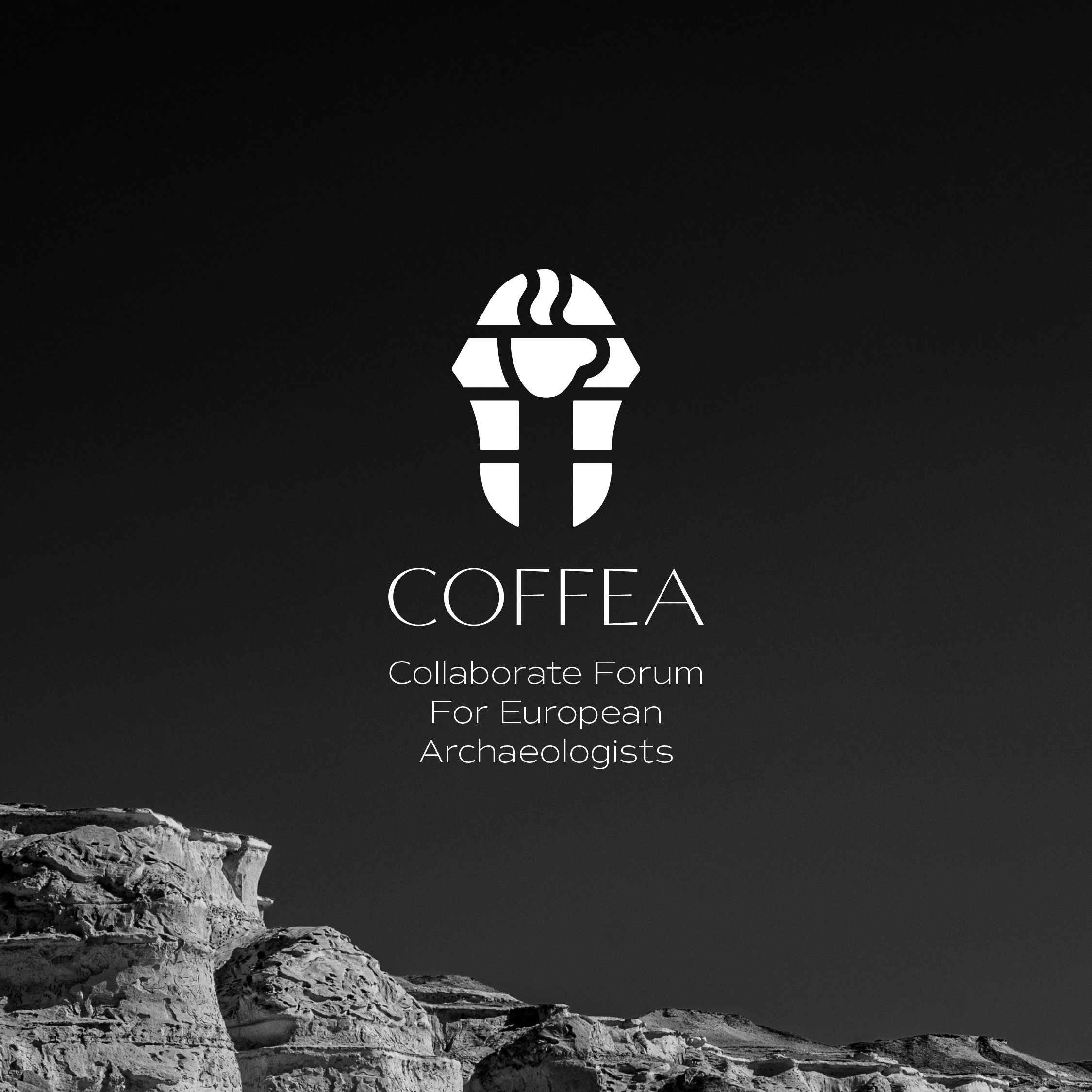
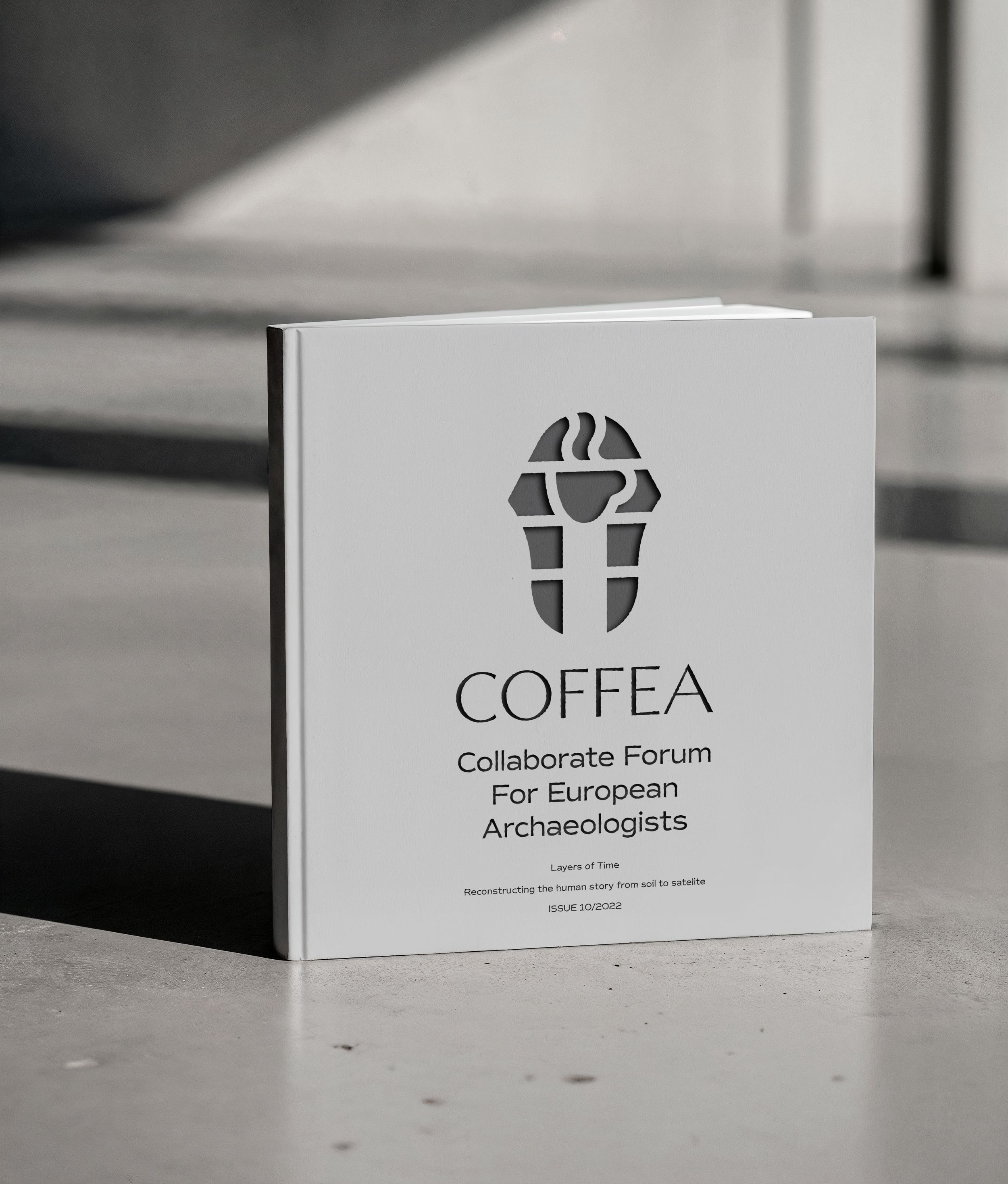
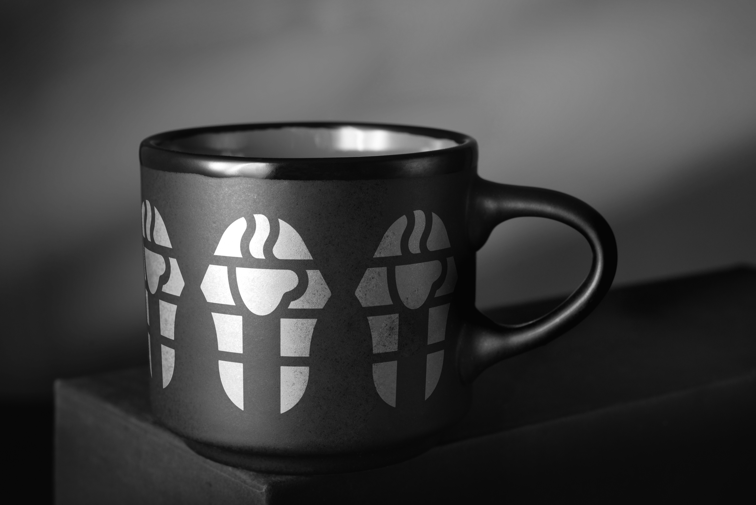
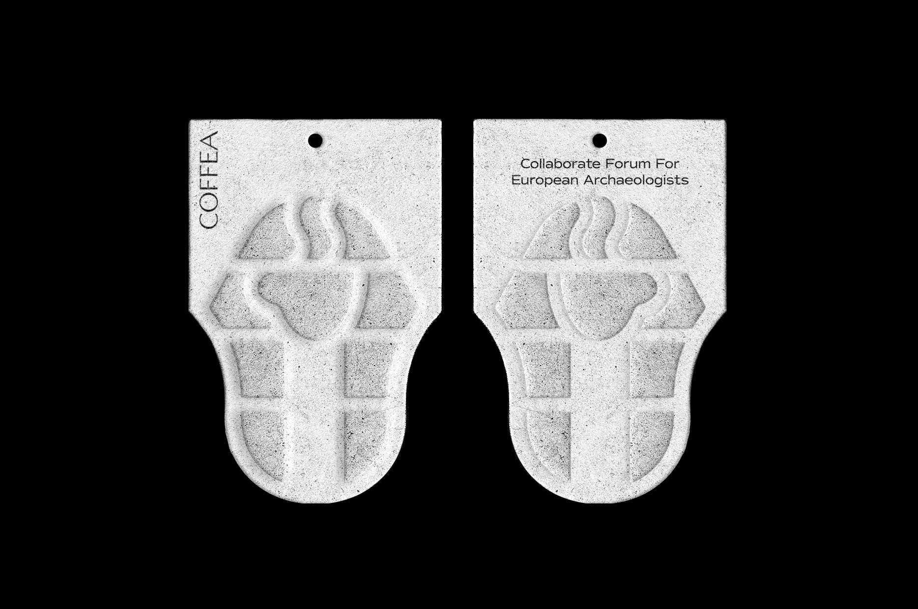
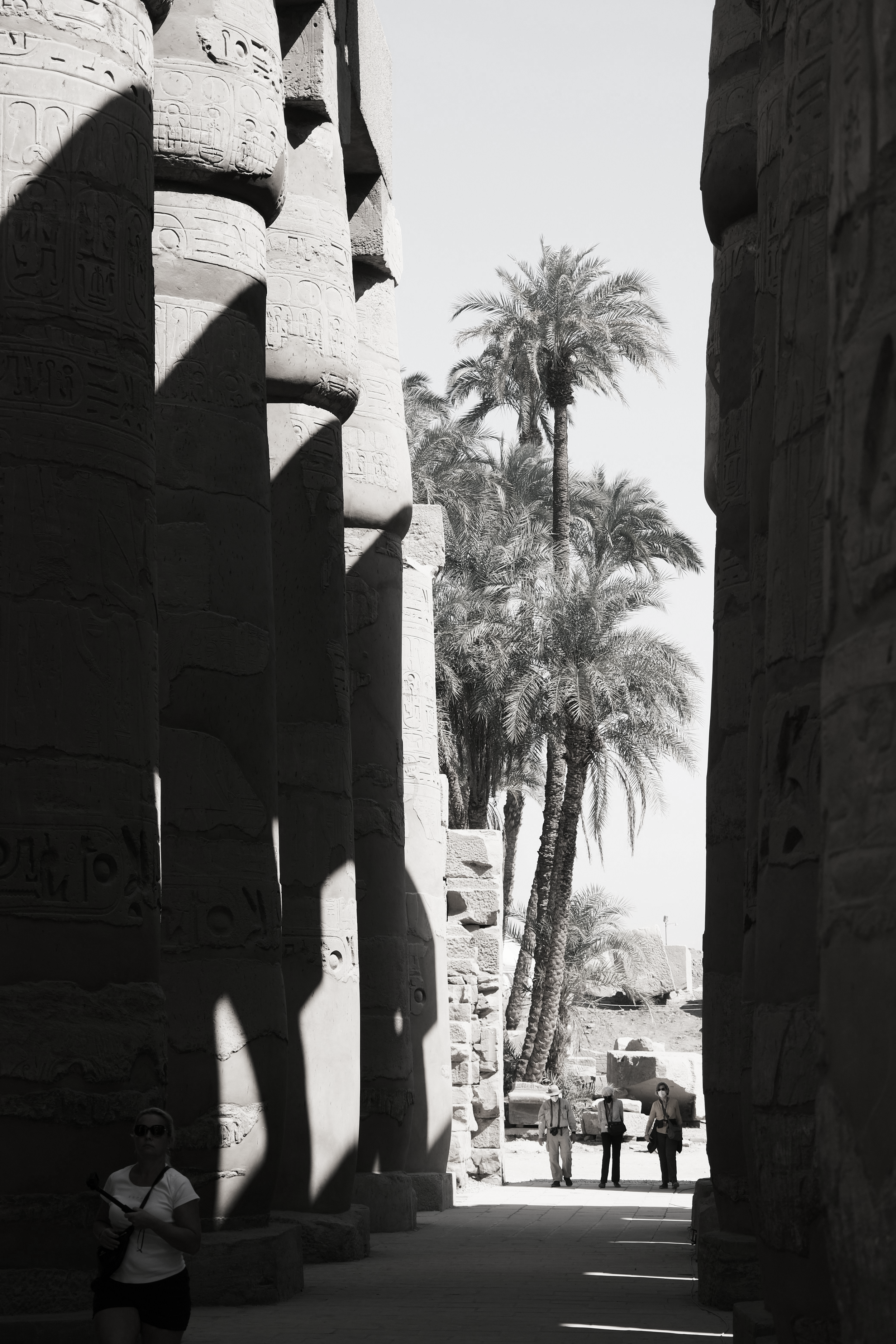
The inspiration for the first proposal comes from the Egyptian Pharaohs in combination with a simple cup of coffee.
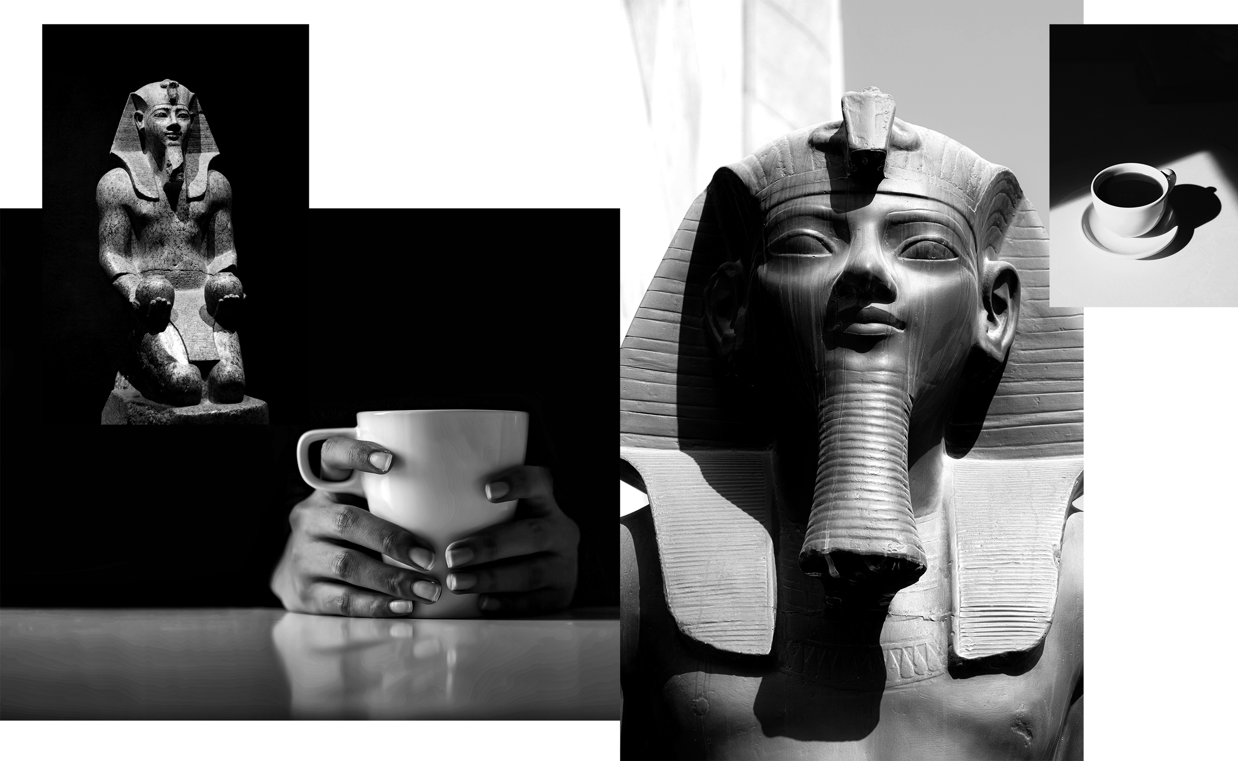
The face of the Pharaoh with a missing ear, initially triggers the curiosity of the viewer who soon realises that this is a cup of hot coffee.
This proposal creates the appropriate associations related to archaeology, while making the name COFFEA memorable with the abstract illustration of the cup of coffee. The mood is casual and relaxed, similar to reading archaeological news online.
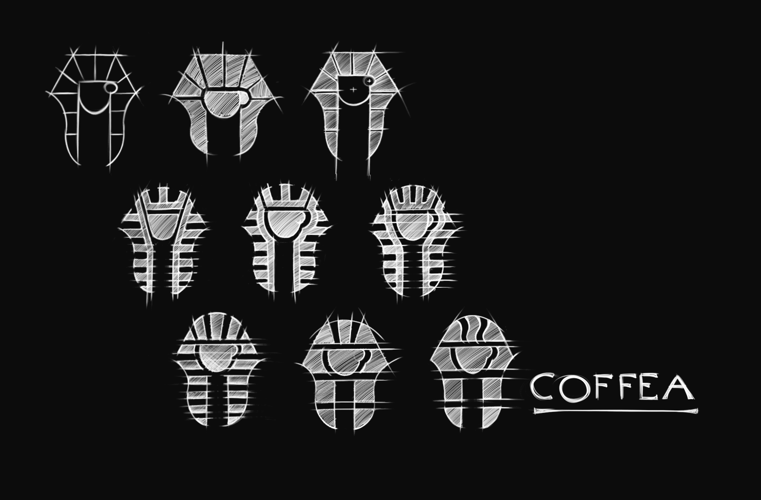
For this proposal, the TT Ricodi Algeria font has been chosen—a typeface with ornamental details inspired by North African and vintage poster aesthetics, giving it a warm and exotic feel. The letters “F” and ”E” were slightly modified toward a more elegant and harmonious design for the purposes of this proposal.
The main logo is accompanied by the full name of the organisation, written in Commuters Sans. This clean and modern sans-serif typeface, emphasizes clarity, balance, and high legibility, with straightforward letterforms designed to be read quickly at a glance, making it ideal for small font sizes.
PROPOSAL 2
The inspiration for the second proposal comes from the Egyptian Pyramids in combination with the beautiful simplicity of the Anglo-Saxon alphabet.
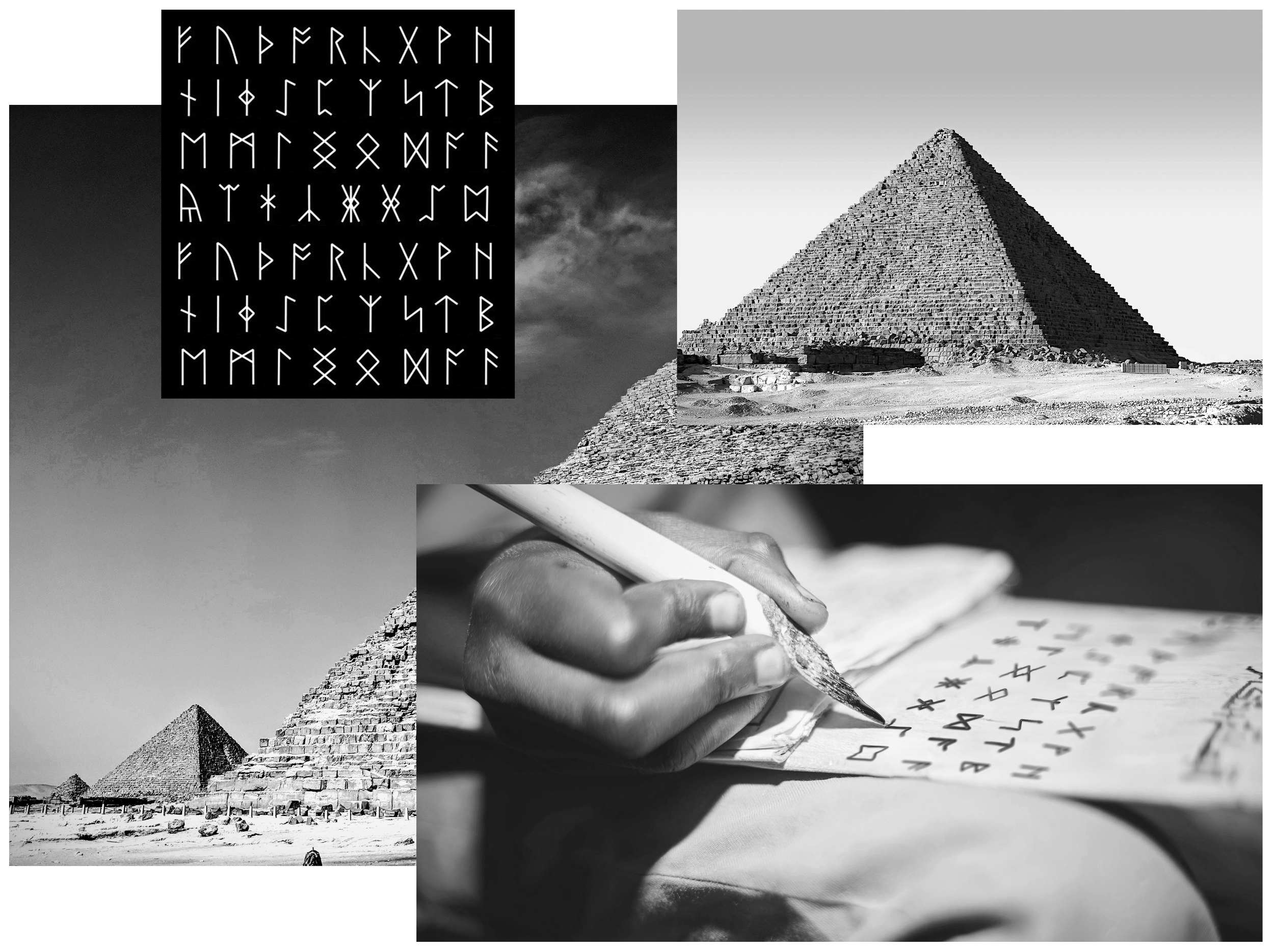
The combination of the two ‘’F’’ provides the main theme for the design of the logo that presents the complete COFFEA name.
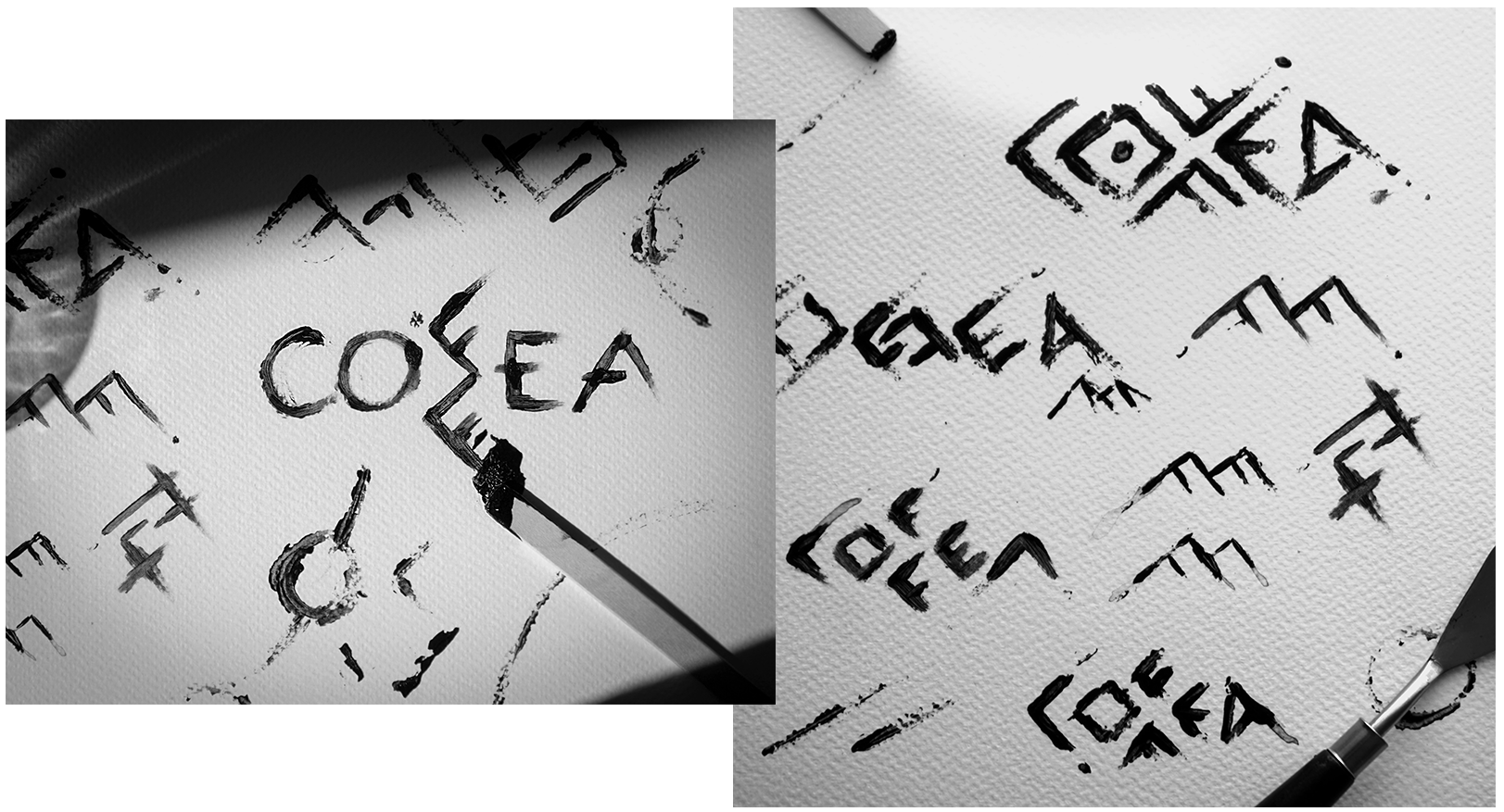
Hand crafted explorations
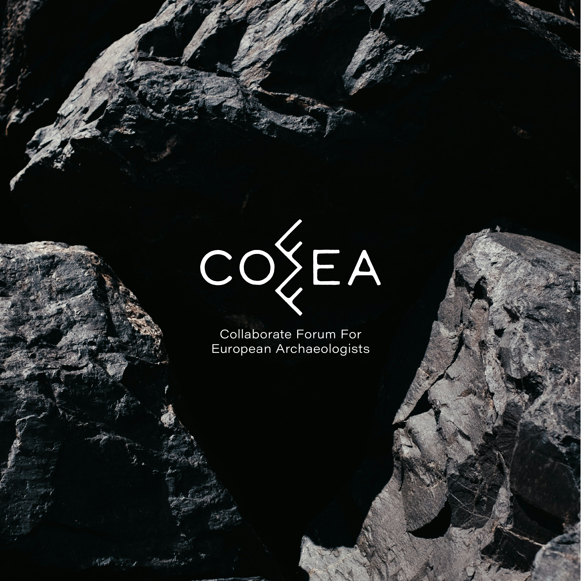
For this main logo, the Calder Dark Grit font has been used. This sans-serif display typeface is modern, while the “grit” effect lends it an authentic, hand crafted, and organic appearance. Its clean and geometric letterforms evoke the characteristics of the Anglo-Saxon alphabet.
The main logo is accompanied by the full name of the organisation, written in the Acumin font. This clean and minimalistic sans-serif typeface contrasts with the textured look of the main logo, enhancing clarity and legibility.

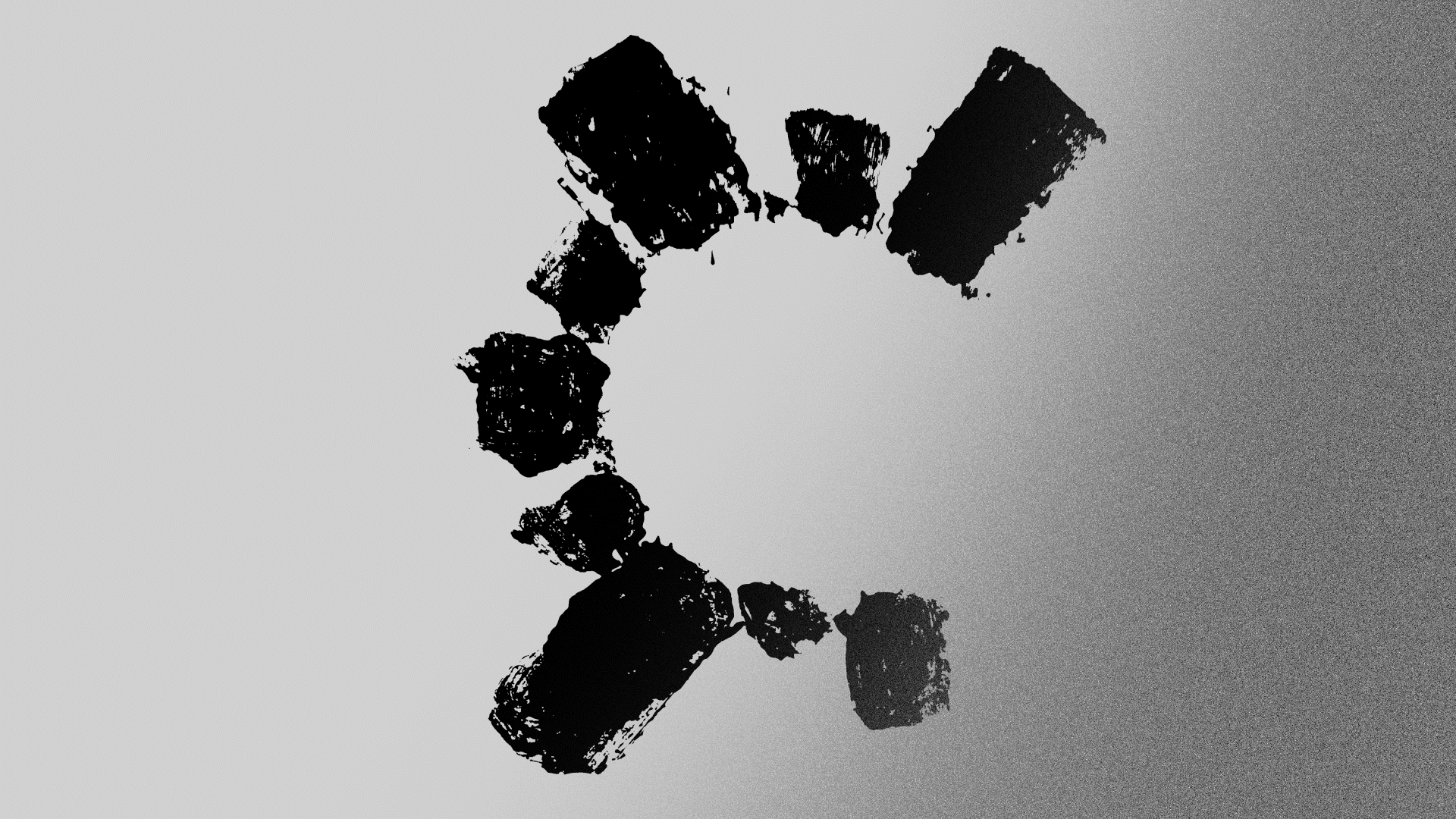
PROPOSAL 3
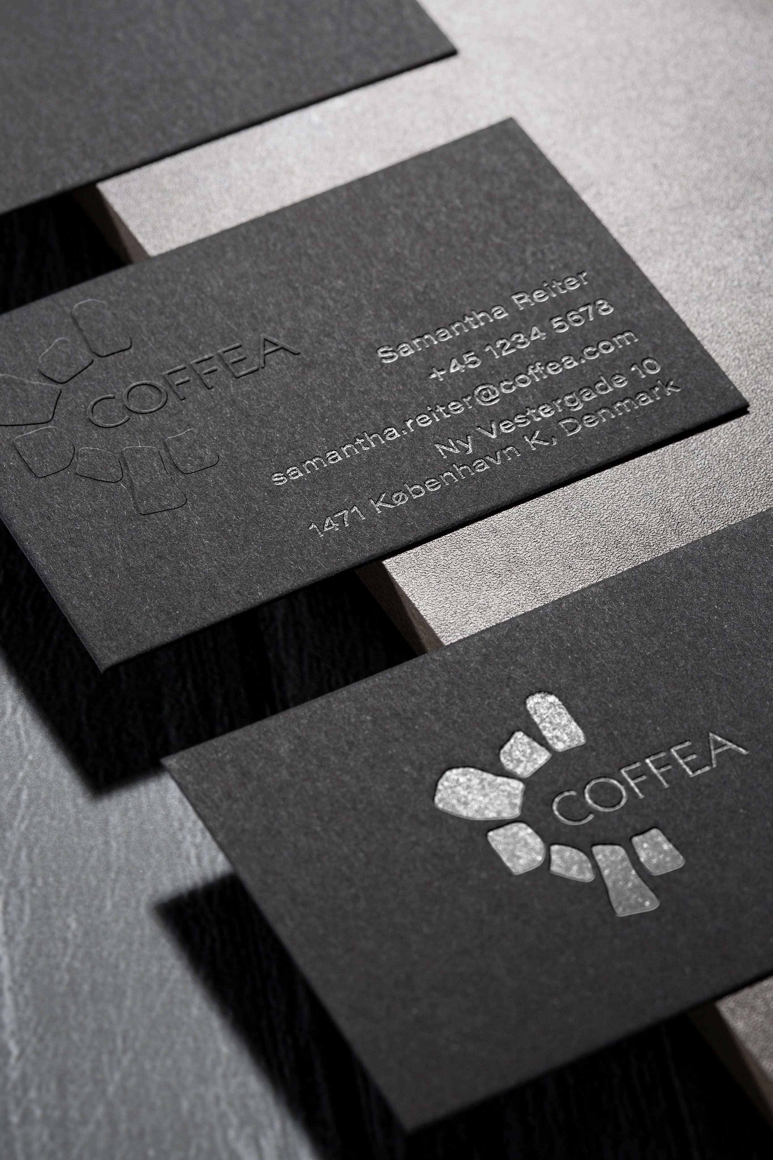
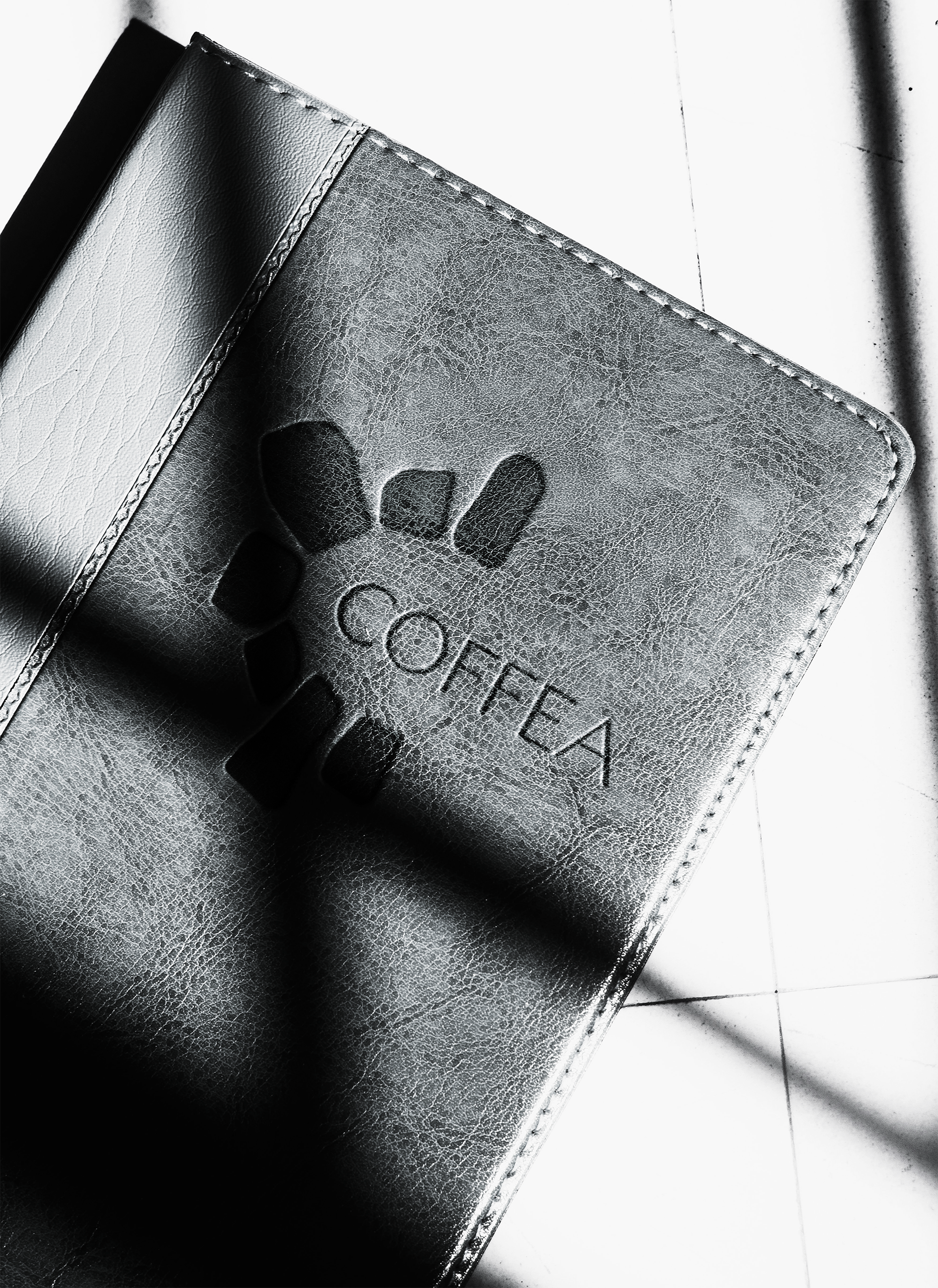
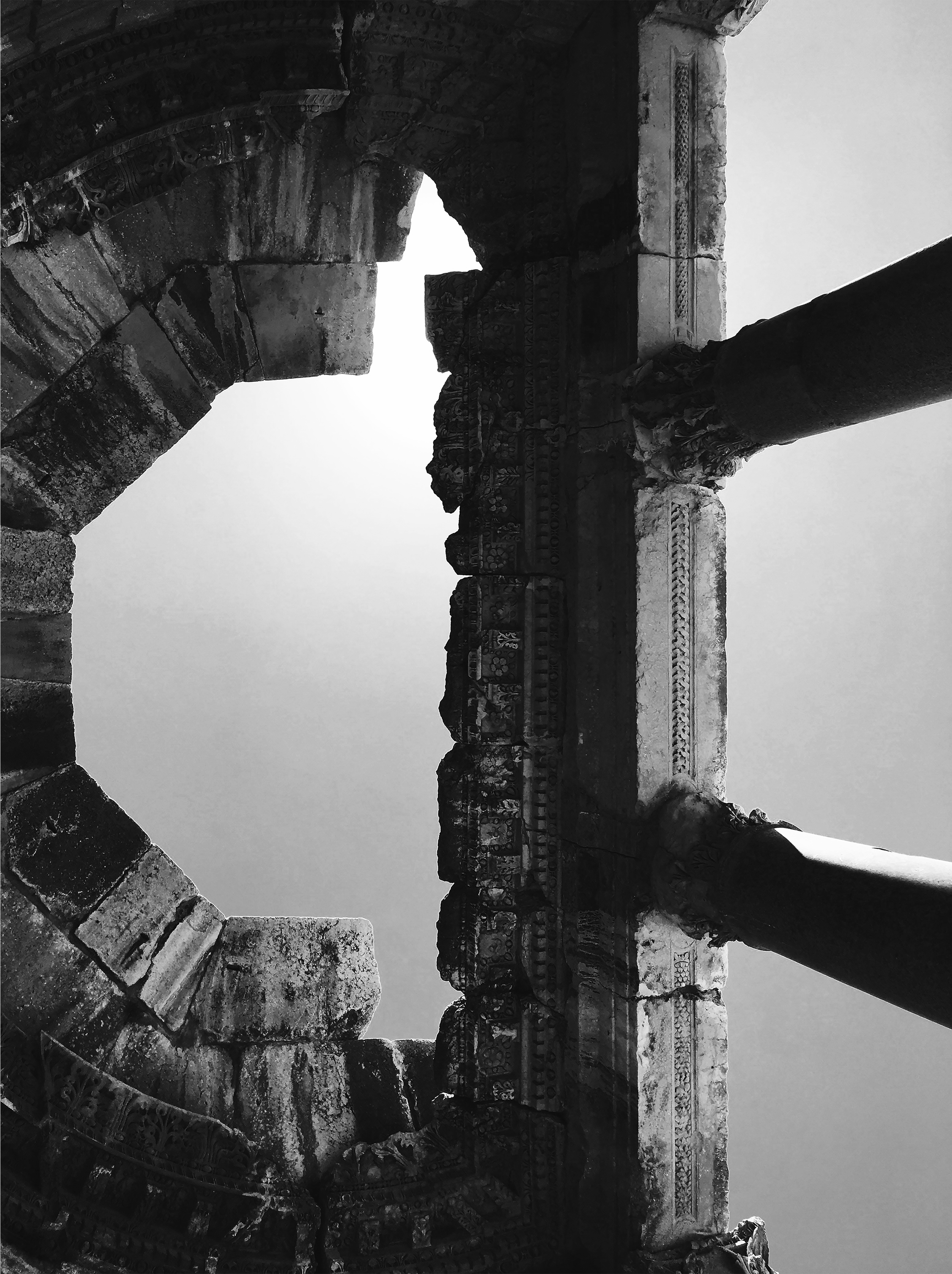
The inspiration for the third proposal comes from the beautiful top views of the discovered ancient cities. Theatres, castles and empire walls maiden from stones and marbles provide a very interesting theme for the generation of an initial letter - based logo.
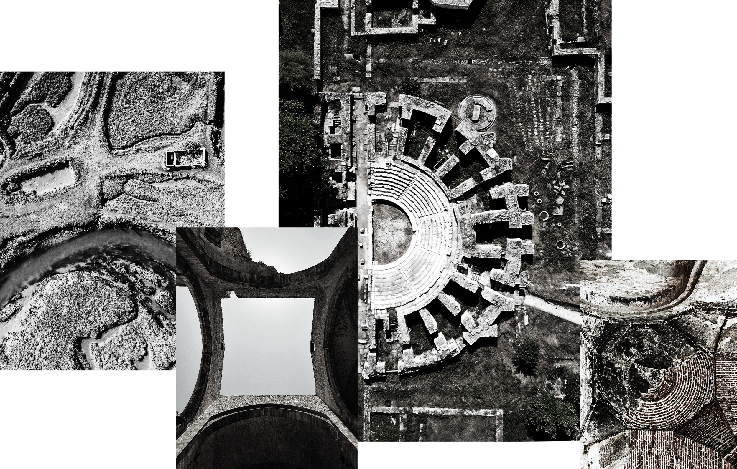
The initial “C’’ of the name COFFEA is formed by organic shapes triggering the relevant associations to the viewers.
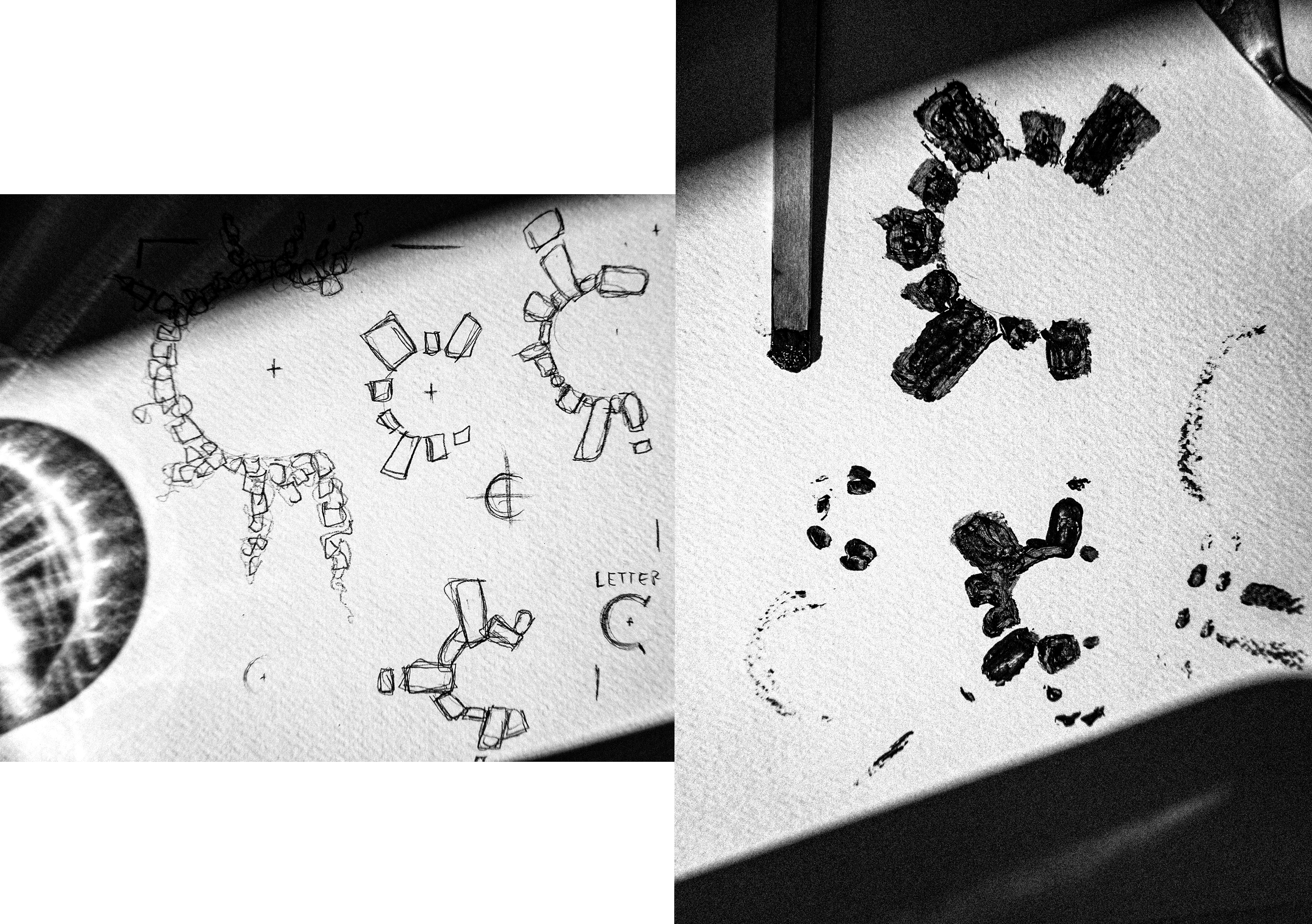
Hand crafted explorations